Hilton Hotels & Resorts UX Case Study
Role in the Project
My role in the project as a UX designer working on to redesign the Hilton Hotel’s website. My responsibility includes user research, wireframing and usability testing.
Project Duration: Feb 2020 to March 2021
Purpose of Project
Hilton Hotels & Resorts is a global brand of full-service hotels and resorts and the flagship brand of American multinational hospitality company Hilton. This project is an effort to address the problem of declining travel bookings in Hilton Hotels website. Hilton’s stakeholders wanted travellers to be able to co-operatively plan, book and travel, making it easier for teams to stay together for work or pleasure trips.
Primary Objectives
Understand how and why users are currently booking hotels on Hilton website.
Discover users’ motivations behind booking and get a deep understanding of the journey of users throughout the website.
Uncover other websites users are using to book hotels.
Learn about any pain points users are encountering during their process, and what improvements they might require.
Target Audience
Corporates/any individual who wished to book hotels.
Design Strategy
Designing Thinking approach was taken to understand users, define the problem and to come up with a creative solution which in turn helped me to redefine the website which make it easier for users to book hotels.
1. User Research
Heuristic Evaluation
Benchmarking/Competitive Analysis
Interview/Contextual inquiry
2. Define & Ideation
Empathy Map
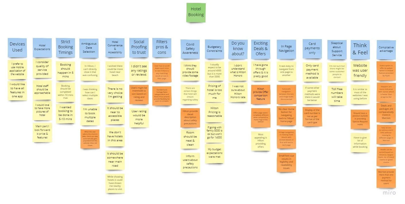
Affinity Mapping
3. Prototyping
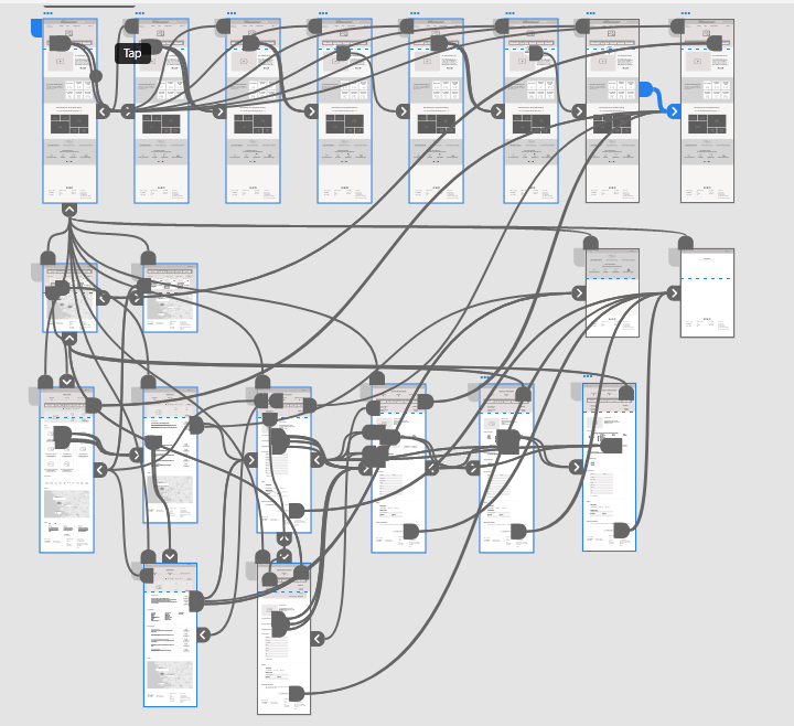
Wireframing
4. User Testing
Key Challenges and Constraints
The challenging part of this project was to recruit the right participants who will be openly sharing their experience and ready to demonstrate and talk about their tasks without waiting for us to ask questions.
User Research
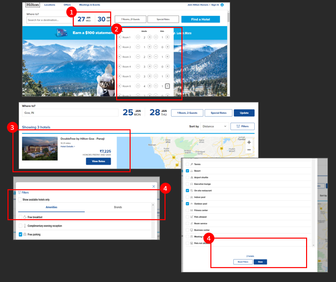
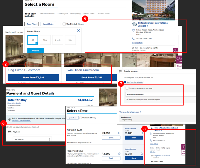
Over the course of our evaluation of Hilton website, we have analyzed its usability issues by using heuristic evaluation as first step to move ahead towards the future UX enhancements.
The aim is to determine design guidelines which can be adopted to make the user experience better. The research allowed us to understand some of the usability issues involved in the process of booking a room through https://www.hilton.com/en/. It also enabled us to see where we might add value for Hilton’s customers.
Common Recommendations after heuristic evaluation.
Date selection component could be re-designed.
Consistency in styling of the buttons in terms of color, size should be maintained throughout the website.
Hero banner on the landing page could be made more attractive and eye-catching by using the images from the hotel industry
Booking journey could be simplified with addition of social element (Reviews, ratings, Popularity) to gain the trust of our customers (new and old).
Visual clutter from the Home page to be removed to make it look simpler and easier to understand the information.
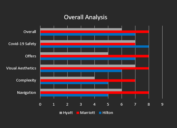
We then moved to benchmarking, here we compared usability problems and features associated with the Hilton website ( https://www.hilton.com/en/ ) against competitors or industry standard at this point.
Modules covered are
1. Booking Hotel
2. Meetings & Events
3. Offers
4. Overall Performance
Competitor’s websites are as follows
1. Marriott Hotels ( https://www.marriott.com/default.mi )
2. Hyatt Hotels ( https://www.hyatt.com/ )
Insights
Overall, Hilton website is simple and easy to use but there are areas where they can improve to provide a better experience for their users.
Booking journey could be simplified with addition of social element (Reviews, ratings, Popularity) to gain the trust of our customers (new and old).
Consistency in terms of fonts, headings, links etc. should be maintained throughout the website. Hilton could work on making website more appealing to users with flexible navigation (Hilton homepage logo) and with more images from hotel industry.
On comparing Hilton with Marriott and Hyatt, all three have strong points of their own. Overall Marriott exceeds Hilton and Hyatt in design and accessibility. Hilton is still able to establish a strong connection with users due to its assurance on Safety and with variety of offers offered.
Interview or Contextual Inquiry
I choose to conduct 4-5 contextual video interviews with people from the target group and have them show me how well they use the website.
This contextual inquiry is a semi structured interview when combined with keen observations helped me to understand users pain points and help to form a deeper connection with them.
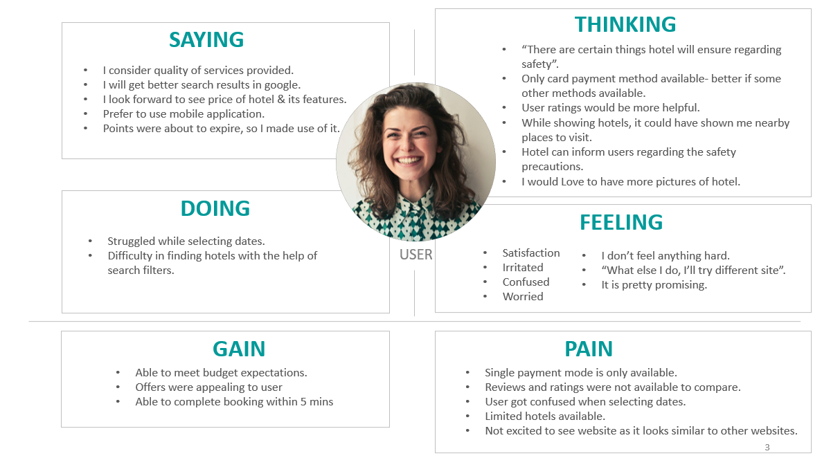
Empathy map was created to get a shared understanding of users and to empathise with them.
Script
I preferred to conduct a semi structured interview. I prepared my script with main questions and topics to be covered. I like to make it more like conversation rather than interview. I tried to keep conversation going by asking more open-ended questions. Even if session is recorded, I tried to take notes of my own. Users were clearly informed what is going on. Follow-up question were asked and by end of the session users were appreciated for their time and effort.
User Interview Questions
These are few questions I asked to the users during the interview session.
1. Describe the last time you struggled with booking a hotel, what was that like?
How did you solve the problem?
2. How would you describe your past and current experience with Hilton website?
What was your primary & secondary goals when visiting this website?
3. What do you like or dislike about using Hilton website and why so?
Is there anything you often look for on website that is missing or hard to find?
What was the feeling you had when you couldn’t find what you’re searching for?
4. Can share your screen and walk me through the normal booking procedures you follow while booking a hotel in Hilton website?
Tell me more about the budget expectations and factors you consider while picking any hotel.
What would you think about the Hilton offers? Tell me more about that.
In the scale of 10, how do you rate the interaction throughout the website and why?
5. What improvements could be made to make this website easier or better?
Empathy Map
Empathy map was created to get a shared understanding of users and to empathize with them.
Affinity Mapping
As a part of affinity mapping ideas and insights are sorted into groups based on their natural relationship, for review and analysis.
Wireframes
Feature Highlights
Wireframes are designed keeping users concerns and pain points in mind and also following the standards of visual design. Below mentioned are few highlights from the design.
Separate Calendars were set for Check In and check out to avoid the confusion in selecting dates.
Near Visit option helps users to identify the nearby location to visit, along with the distance and time to reach the destination.
Ratings and reviews are added along with hotel amenities, to help users to faster the process of selection of rooms or hotels.
Photos of the hotels and rooms are added to attract users and keep users more engaged in using the website.
Users have access to multiple payment options including net banking, upi payments
Results of User Testing
The main focus of this user testing was to check if the website meets the user expectations.
Methodology used:
1. Planning : - Identifying and defining scope
2. Recruiting : - Assigning and explaining the task
3. Task execution : -Capturing un biased results
4. Analysis : -Segregating and analyzing the pattern
Task 1 : Book a King Guest room in Goa.
User Findings
Around 4-5 users are recruited for user testing of Hilton’s newly designed workable prototype. All the users were able to complete the task in ease.
Users were able to select dates easily without confusion.
Users were more interested in exploring the website.
Users were able to see multiple payment options.
Users were interested in seeing reviews, ratings and photos.
Almost all the users were able to get information about nearby places to visit.
Conclusion
User validation testing session validated the improved designs were neat and users find it easy to navigate and book hotels which in turn matching the business requirement brief.

